How Many Images per Blog Post? A Practical Placement Guide
A tested method for deciding how many images a long-form blog post needs, where to place them, and which suggested visuals to remove.
For most 1,500–2,500 word blog posts, three to five in-body images is a useful starting range. It is not a rule. The right number is the smallest set that helps readers understand, remember, or navigate the article.
We tested that principle on a 1,600-word article with seven sections. A mechanical “one image every 300 words” rule would have produced six images. An AI analysis of the complete article also recommended six visual anchors. After editorial review, we kept four. The first image could also serve as the article's cover, so the post did not need a separate decorative hero.
The complete test used 130 NarraTwin credits: 5 for the initial anchor plan, 100 for four illustrations, and 25 for one targeted revision. This guide explains why we removed two apparently relevant images, where we placed the remaining four, and what failed during production.

The quick answer: count visual jobs, not words
A word-count ratio is useful as a warning, not a target. If a 2,000-word article has no visual break at all, it may feel dense. If it has ten decorative images, the images may interrupt the argument more than they help it.
Instead, count the places where an image has a specific job:
- Make an invisible process visible.
- Compare two states or choices.
- Explain a framework that is slower to understand in prose.
- Show first-hand evidence, a result, or a real example.
- Reset reading pace after a genuinely dense section.
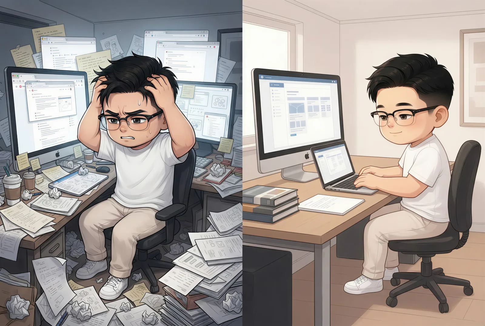
One image can do more than one job. The split scene above introduces the article, compares focus with fragmentation, and gives the reader a visual model for the problem. Adding another generic desk photograph near the introduction would not create another visual job.
Our practical default is:
- Start with one potential visual for each major idea, not each heading.
- Remove any visual that only repeats the heading in picture form.
- Keep neighboring images far enough apart that each one marks a real transition.
- Reuse a strong first content image as the cover when the publishing system allows it.
This often leads to three to five content images for a substantial article, but a technical tutorial with screenshots may need more. A personal essay may need one or none.
Why “one image every 300 words” breaks down
For our 1,600-word source article, the common 300-word ratio suggests roughly six in-body images. Add a separate cover and the page reaches seven images.
That number sounds tidy because it is measurable. It ignores what the words are doing.
A 300-word passage can contain a complete three-step framework that benefits from one diagram. Another 600-word passage may be a continuous narrative that becomes weaker if it is interrupted halfway through. Two adjacent sections may make the same point from different angles, so illustrating both creates repetition rather than clarity.
Ratios also encourage images to be placed at arbitrary distances. The reader sees an illustration because a counter reached 300, not because the argument reached a moment that deserved visualization.
We still use word count as a final check. Four images across 1,600 words works out to roughly one image per 400 words. That tells us the page is not visually empty. It does not explain why the four images belong there.
Our test: six recommendations became four placements
The source article, “Building a Creative Week That Protects Deep Work,” contained seven sections:
- an introduction;
- the cost of a fragmented morning;
- mapping energy before tasks;
- separating making, managing, and recovery;
- batching related publishing work;
- leaving buffer for revision and failure;
- ending the week with an evidence-based review.
NarraTwin read the complete structure and recommended six cognitive anchors—one after every major section except the introduction. All six recommendations were topically relevant. Relevance alone was not enough.
We removed the batching image because it repeated the operating-mode framework. Both would have shown a creator grouping similar tasks to reduce context switching. The article explains batching clearly in prose, so a second workflow image would have added little.
We also removed the final weekly-review image. It would have summarized ideas that the previous visuals had already established. The conclusion worked better as a quiet return to the argument instead of another full-width interruption.
The final four placements formed a clearer sequence:
| Position | Visual job | Why it stayed |
|---|---|---|
| Fragmented morning | Compare focus and distraction | Makes the article's central problem visible |
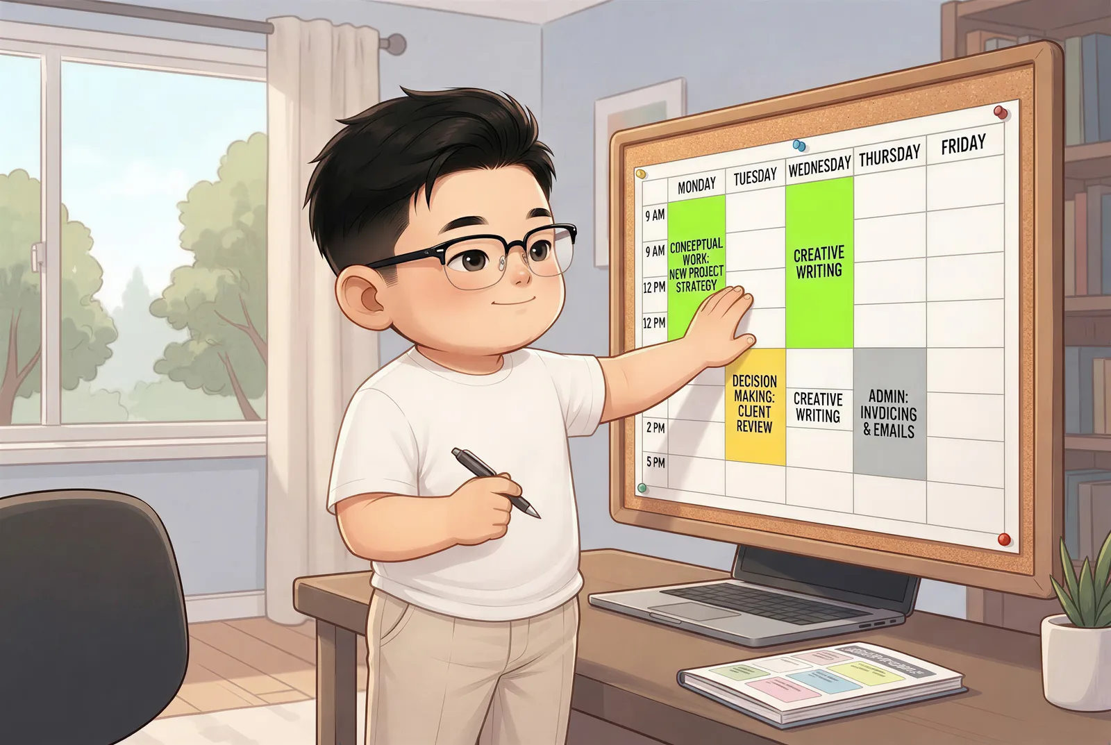
| Energy map | Turn an abstract planning method into a schedule | Gives readers a model they can copy |
| Three operating modes | Explain a three-part framework | Compresses several paragraphs into one scan |
| Revision buffer | Show how empty calendar space absorbs failure | Visualizes the least intuitive recommendation |
The editing decision saved 50 credits in initial image production and produced a less repetitive article.
Where to place images in a blog post
An image should normally appear after the text establishes why the reader needs it. This gives the visual context and lets it function as an answer rather than an unexplained interruption.
In our test, the first illustration appeared after the fragmented-morning section had described the cost of reconstructing context. The image compared a calm desk with a chaotic, notification-filled desk. Placing it before the example would have revealed the conclusion before the article created the problem.
The second image appeared after the energy-mapping method. It turned the advice into a weekly grid: high-energy windows for conceptual work and lower-energy windows for administrative tasks.
The third followed the explanation of making, managing, and recovering. It gave each mode a separate panel, allowing readers to understand the separation at a glance.

The fourth appeared after the recommendation to reserve 10–20% of the week for revision and unexpected production problems. That concept is easy to agree with and hard to imagine on a full calendar, so it earned a visual.
Useful placement rules include:
- Do not insert an image directly between a heading and its opening sentence.
- Keep the explanatory paragraph and its image together on mobile when possible.
- Place comparison images after both states have been introduced.
- Use captions or nearby prose to explain what readers should notice.
- Avoid stacking two large images without meaningful text between them.
- Treat the first strong content image as a potential social and cover asset.
What the first image batch got wrong
All four first versions completed successfully in the initial batch. The character identity and warm editorial style remained consistent. The weakest result was the revision-buffer image.
Version 1 communicated the idea, but the calendar contained many tiny generated
task labels. Most were not real words. The central REVISION BUFFER label was
readable, yet the surrounding visual noise made the image unsuitable for an
article about clear planning.
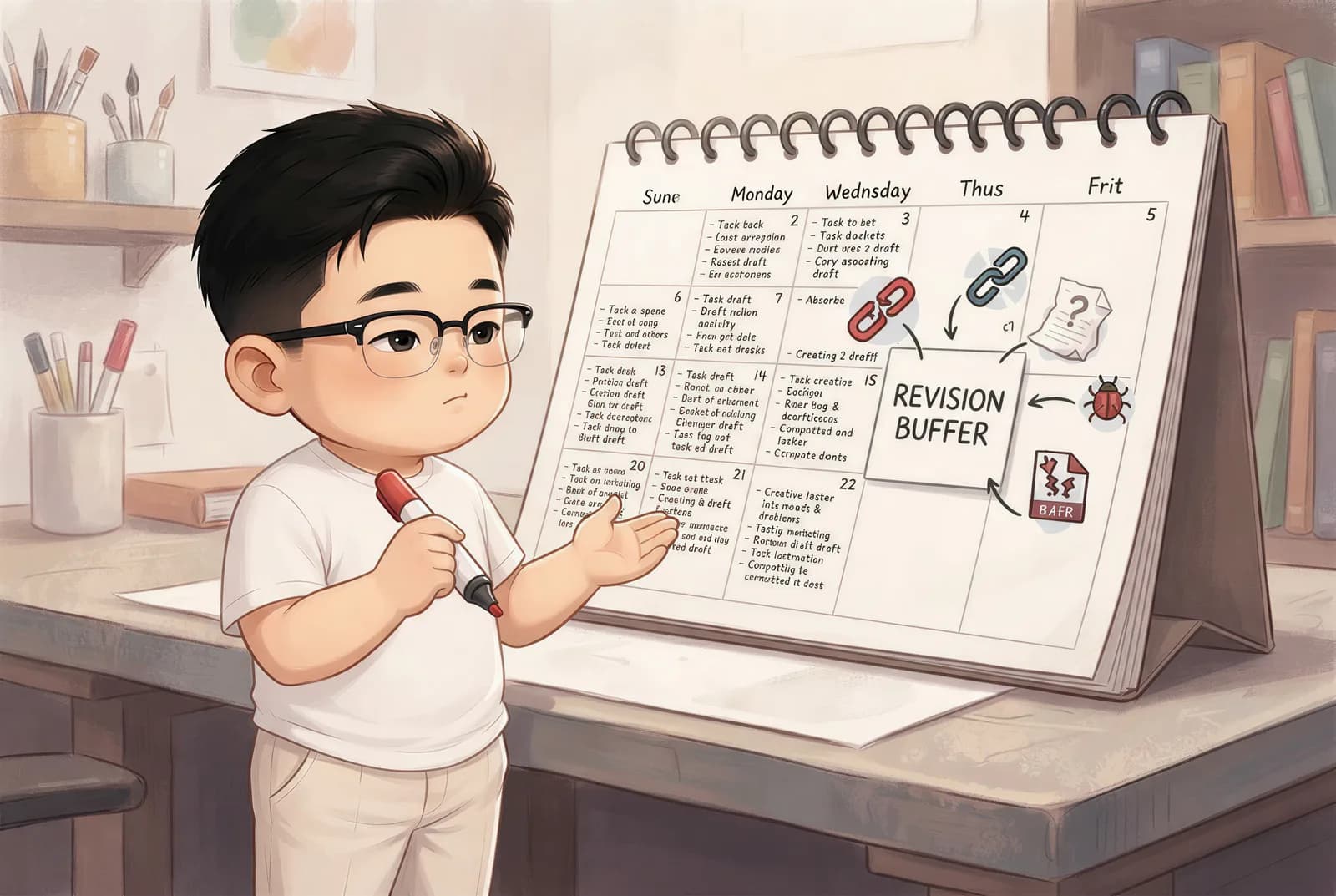
We revised only that image with a narrow instruction: remove the small task and
day labels, replace them with clean color blocks and simple icons, preserve the
character and warm composition, and keep one clear REVISION BUFFER label.
The revision cost 25 credits. Version 2 retained the concept while making the calendar much easier to scan.

This failure matters beyond AI images. An illustration that depends on many exact words is often the wrong format. If the wording must be perfect, build the diagram with real typography or add labels during layout. Use generated imagery for composition, metaphor, atmosphere, and recognizable objects—not for dense text.
A repeatable image-planning workflow
Use this process before generating or sourcing images:
1. Freeze the article structure
Finish the main argument and headings first. Planning images against a moving draft creates anchors for sections that may later disappear.
2. Mark every possible visual transition
Look for comparisons, processes, frameworks, evidence, emotional turns, and dense explanations. At this stage, over-collecting is fine.
3. Write one sentence describing each image's job
If the sentence says only “make this section more attractive,” the image probably does not deserve a place. A stronger description is “compare uninterrupted deep work with the cost of five simultaneous channels.”
4. Remove neighboring ideas that would look similar
This was the decisive step in our test. Batching and operating modes were distinct in prose but visually repetitive. We kept the image with the clearer framework.
5. Generate the set and review each image in context
Judge concept accuracy, text artifacts, character consistency, and reading flow. Do not regenerate the whole set when one image fails. Revise the smallest unit.
6. Run the publishing checks
Compress images, provide descriptive alt text, declare dimensions to reduce layout shift, and check the article on a narrow screen. A useful image that makes the page slow or inaccessible is not finished.
NarraTwin's AI blog image generator is designed around this sequence: it reads the complete article, recommends source-grounded anchors, lets the editor remove weak positions, and generates the approved images as one connected set. You can also start a new article and apply the same workflow to your own draft.
Frequently asked questions
How many images should a 1,000-word blog post have?
Start by looking for two or three genuine visual jobs. A simple opinion piece may need one strong image, while a 1,000-word tutorial may need six screenshots. The content type matters more than the word count.
How many images should a 2,000-word blog post have?
Three to five in-body images is a reasonable first planning range for many long-form articles. Add or remove images based on frameworks, evidence, examples, and major narrative transitions.
Does every heading need an image?
No. In our test, an image after every major heading produced six recommendations, but two were visually redundant. A heading creates structure; it does not automatically create a visual job.
Where should the first image appear?
Use a strong image near the introduction when it establishes the article's main problem or promise. If it is purely decorative, it can remain a cover image rather than interrupting the opening argument.
Do more images improve SEO?
Not automatically. Original, relevant images can improve comprehension and make a page more useful, but extra files can also slow the page and distract readers. Optimize for usefulness, descriptive context, accessibility, and performance—not an arbitrary image count.