How to Create Images for Blog Posts with AI: A Practical Workflow
A first-hand workflow for turning a finished blog draft into a useful image set, including anchor selection, prompt editing, revision, cost, and publishing checks.
To create images for blog posts with AI, start with the finished article—not an isolated image prompt. Mark the ideas that genuinely become easier to understand as visuals, remove repetitive positions, write one clear job for each remaining image, generate the set in a consistent style, and revise only the frames that fail.
We tested that workflow on an original 1,643-word article called “A Newsletter Production System That Survives a Busy Week.” NarraTwin analyzed seven content sections and suggested seven cognitive anchors. We kept four, edited every visual brief, generated four first versions, and revised one image that contained generated pseudo-text.
The completed case used 130 credits: 5 for anchor recommendations, 100 for four initial illustrations, and 25 for one revision. From source confirmation to final approval, the recorded workflow took 22 minutes 11 seconds. That total includes editorial review between jobs; the anchor analysis itself took 11.7 seconds, the four-image batch took 2 minutes 22 seconds, and the revision took 3 minutes 15 seconds.
The practical workflow in one view
A reliable blog-image process has seven steps:
- Freeze the article's argument and headings.
- Find moments that need a comparison, process, model, or first-hand evidence.
- Give every proposed image one specific visual job.
- Remove neighboring ideas that would produce similar pictures.
- Rewrite briefs to avoid fragile details such as dense generated text.
- Generate a connected set, then inspect every frame at full size.
- Revise the smallest failed unit and prepare the final files for the web.
The order matters. Starting with “make me a hero image about productivity” may produce an attractive picture, but it does not tell you whether the article needs that picture, where it belongs, or what the next three images should do.
Starting from the complete draft keeps every image tied to a reader question. It also makes visual consistency a system-level decision instead of a prompt-by- prompt accident.
1. Freeze the draft before planning images
Our source article was complete before image planning began: 1,643 English words, 10,179 characters in the import interface, and seven content sections. It explained a production system for independent newsletter writers, from defining a promise through closing the cycle after publication.
Freezing the draft prevented two common problems. First, we did not spend money illustrating a section that might later disappear. Second, the analysis could see relationships across the complete article. A “minimum viable issue” section, for example, made more sense when read alongside the later recommendation to reserve a revision buffer.
The article does not need to be polished down to every comma. It does need a stable promise, section order, and conclusion. If those are still changing, image planning is premature.
2. Turn sections into visual jobs
The first analysis recommended seven anchors. All seven were relevant to the source, but relevance was not enough. We asked a harder question for each one: what can this image communicate faster or more memorably than the nearby paragraphs?
We kept these four positions:
| Position | Visual job | Why it earned an image |
|---|---|---|
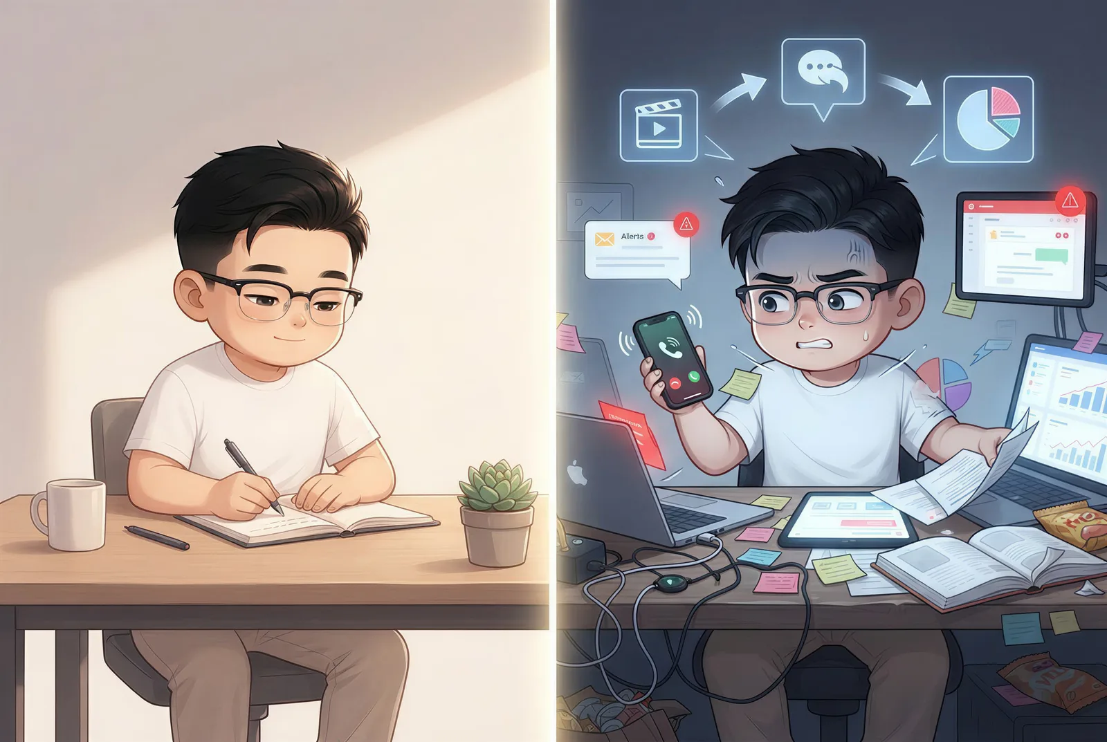
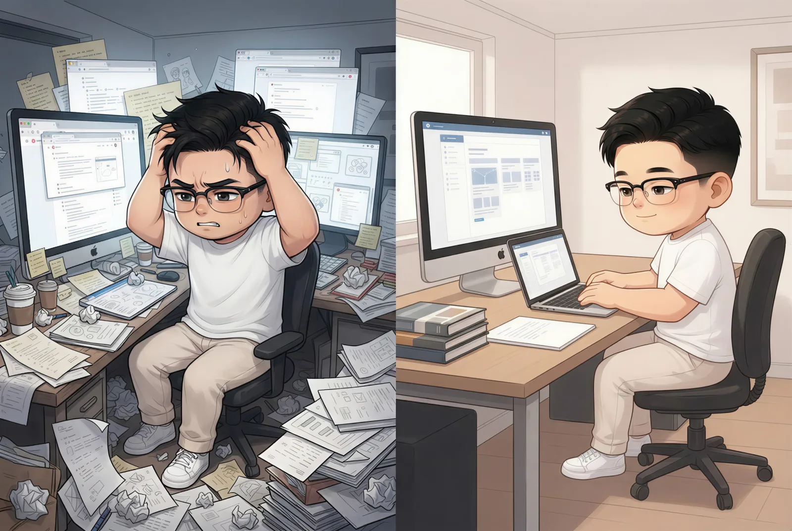
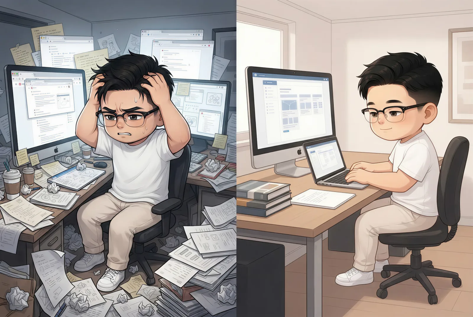
| Opening problem | Compare a brittle workflow with a sustainable one | Establishes the central contrast and doubles as the cover |
| Source queue | Show many inputs becoming a small working set | Makes an invisible filtering process visible |
| Minimum viable issue | Show a complete core protected by removable layers | Explains controlled reduction without a long checklist |
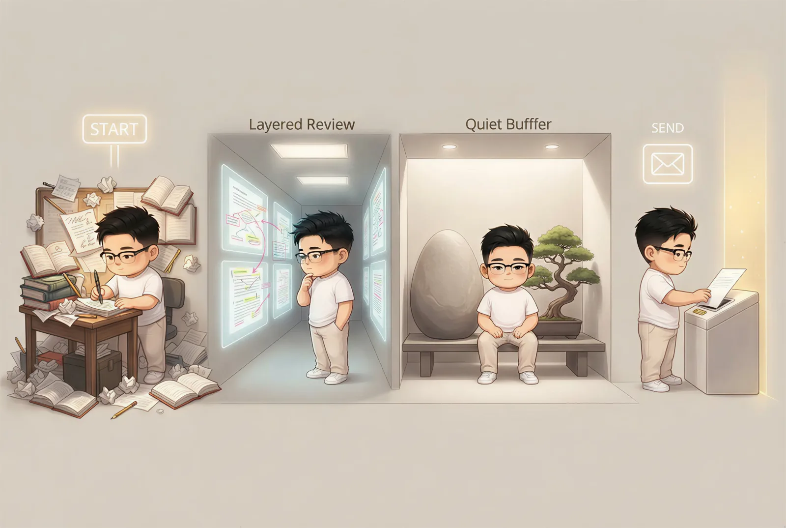
| Revision window | Show drafting, review, buffer, and sending as distinct phases | Turns an abstract scheduling recommendation into a sequence |
We removed the one-sentence-promise anchor because the prose already explained it cleanly. We removed a drafting-versus-packaging image because it would have looked too similar to the opening workflow comparison and the later revision sequence. We also removed the closing-cycle anchor: the conclusion needed a quiet landing, not another full-width interruption.
This is the same principle behind deciding how many images a blog post should have: count visual jobs, not headings or words.
3. Write an image brief that can survive generation
A useful brief describes the communication task, composition, continuity, and known failure modes. It does not need to dictate every object.
Our initial system suggestions included a diagram with several labels and a timeline with named phases. Before generation, we rewrote all four visual intents. For the source queue, the revised brief asked for a cloud of loose notes flowing through a sorting path into a small set of color-coded cards. For the minimum viable issue, it asked for a complete center protected by removable paper layers.
Every brief also specified:
- a wide editorial composition suitable for a blog page;
- the same creator and warm visual language across the set;
- no logos, watermarks, screenshots, or dense interface panels;
- no required small labels, numbers, or exact typography.
That last constraint is important. Generative images are good at composition, metaphor, atmosphere, and recognizable objects. They are unreliable typesetting systems. If exact text is essential, create it with real typography after image generation or build the visual as a designed diagram.
4. Generate the set and inspect the whole sequence
The four-image batch cost 100 credits and completed in 2 minutes 22 seconds. All
four jobs succeeded on their first processing attempt at 2500×1677 pixels. The
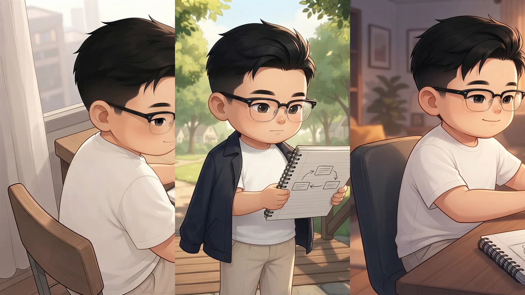
shared kyle · Version 1 Visual Twin kept the same glasses, dark hair, white
shirt, proportions, and warm editorial style across the set.
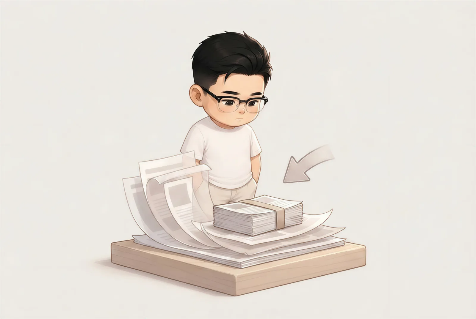
Reviewing the images together exposed issues that a one-image-at-a-time workflow could miss. The opening split scene established the visual identity. The paper- layer metaphor was intentionally quieter, which gave the middle of the article a useful pause. The final sequence used four stations and more negative space, so it felt like progress rather than another comparison.
Consistency does not mean identical composition. It means a reader can recognize that the images belong to the same article and world. For more identity-specific techniques, see our tested guide to creating consistent characters with AI.
5. Revise the failed frame, not the entire batch
The source-queue image was the weakest V1. Its broad composition was correct: many fragments moved through a funnel toward a smaller set. But the model added several prominent cards with pseudo-labels such as malformed English phrases. Those labels were not requested, and they distracted from the filtering idea.

We did not regenerate all four images. The revision instruction targeted only the failure:
- remove every written label, badge, and interface panel;
- use blank color-coded shapes and simple icons;
- keep the messy source cloud, the funnel, the creator, and the warm style;
- make the result a visibly smaller working set.
The V2 revision cost 25 credits and took 3 minutes 15 seconds. It removed the pseudo-text and made the transition easier to scan.

The revision was not mathematically perfect. We requested exactly four output cards; the image produced a small cluster of roughly five icon cards. We accepted it because exact item count was not part of the article's claim. The important meaning—many uncommitted inputs becoming a small usable set—was clear. If the article had promised a four-item method, this would have required manual layout or another revision.
The final timeline also used four short labels despite a no-text preference:
START, Layered Review, Quiet Buffer, and SEND. We checked each at full
size. They were readable, accurate, and sparse enough to keep. This is why “avoid
generated text” is a review rule, not a reason to skip human inspection.
6. Prepare AI-generated blog images for publishing
The generated PNG files were 2500×1677 pixels and ranged from roughly 2.6 MB to 5.2 MB. They were too large to ship directly on a blog page.
For publication, we resized the selected images and the useful before/after evidence to 1600×1074 and converted them to WebP. The four final images total well under 500 KB after conversion, while remaining large enough for full-width desktop display.
Our publishing checklist is:
- use descriptive filenames such as
source-queue-filter.webp; - write alt text that explains the picture in its article context;
- reuse the strongest content image as the hero instead of adding decoration;
- keep explanatory prose close to its corresponding image;
- inspect every generated word, hand, face, repeated object, and boundary;
- check image loading and reading flow at a 390px mobile width;
- confirm that compression did not introduce distracting artifacts.
Do not optimize only for the smallest file. A blurred framework is no longer a useful framework. Resize to the largest display size the site actually needs, then choose a quality level that preserves the edges and focal details.
Cost and timing from the real test
| Stage | Result | Cost | Recorded time |
|---|---|---|---|
| Analyze the complete draft | 7 candidate anchors | 5 credits | 11.7 seconds |
| Editorial selection | 7 candidates reduced to 4 | 0 credits | Included in supervised session |
| Generate first versions | 4 of 4 completed | 100 credits | 2 minutes 22 seconds |
| Revise source-queue image | V2 accepted | 25 credits | 3 minutes 15 seconds |
| Source confirmation to final approval | Completed article image set | 130 credits | 22 minutes 11 seconds |
The total does not include writing the original 1,643-word source article or writing this tutorial. It measures the in-product workflow after the source was confirmed. Most of the difference between job time and total time was deliberate human work: comparing anchors, rewriting visual intents, inspecting the four V1 images, and deciding whether V2 was good enough.
A reusable checklist for your next article
Before generating:
- Can you summarize the article's promise in one sentence?
- Are the headings and section order stable?
- Does every proposed image have a job beyond decoration?
- Would two nearby ideas produce essentially the same picture?
- Does any brief depend on exact generated text?
After generating:
- Does the image match the nearby claim?
- Are character identity, clothing, and visual language consistent?
- Is any text malformed, unnecessary, or too small?
- Does the set vary composition without looking like unrelated stock art?
- Can one failed frame be revised without touching the rest?
- Are the final files named, compressed, described, and mobile-checked?
NarraTwin's AI blog image generator is built around this full-draft workflow: analyze the article, review source-grounded anchors, approve only the useful positions, and create a connected image set. You can start a new article with your own completed draft.
Frequently asked questions
Can I create images for blog posts for free?
You can plan the visual jobs, source public-domain material, make screenshots, or design simple diagrams with free tools. AI generation may have usage costs, but the most important part—deciding what deserves an image—does not require a paid model. Avoid services that promise free images without clear licensing or privacy terms.
Should I make the hero image first?
Not necessarily. Plan the complete set first, then choose the strongest early content image as the hero when it represents the article's real argument. In this case, the opening workflow comparison worked as both evidence and cover.
How many AI-generated images should a blog post use?
Use the smallest set that explains distinct visual jobs. Our 1,643-word test kept four images from seven suggestions, but a screenshot-heavy tutorial may need more and a narrative essay may need fewer.
Should AI images contain text?
Prefer real typography when wording must be exact. A few large generated words may be acceptable after full-size inspection, but dense labels, tables, and UI should be designed or captured with tools built for precise text.
Is one prompt enough for a whole article?
One global style and character definition is useful, but each placement still needs its own visual job. The set should share identity and art direction without repeating the same composition four times.